ILLUSTRATION
PORTFOLIO
This is my portfolio to showcase my Illustration work. My focus is on creating captivating images through colour and shape design, targeted towards children and young adults.
sun AND
MOON
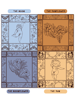
An Illustration exercise, self-directed, based around turning my digital artworks into vectors that can be used anywhere.


MUSHIES
Mushies is a Zine that I created to practice book design and show off the mushrooms that I found in 2025. It gave me an opportunity to figure out book layouts, covers and how to integrate my illustrations into a physical collective, format.
I created Illustrated iconography to add interest to my photographic pages and to illustrate my reactions and thoughts, this works especially well as I don't generally want too many pictures of my real face everywhere. I also created illustrations of some of the stand out mushrooms I found to be displayed between photographic pages, with their name and date found underneath.
The zine is also created using a limited colour scheme of 4 colours, adding an extra layer of challenge to the whole project as I always find it difficult to do in digital work.
I'm showcasing the front and back covers and the pages that have the most illustrated content and embellishments.
LIBRARY
CARDS
I have created two sets of library cards targeted towards young children with the goal of encouraging reading.
In a technology forward world with constant stimulation, children are loosing the joy of reading and diving into your imagination.
As an adult, I've fell back in love with reading and enjoy the immersion into a non digital world that I've been missing for so long. As a dyslexic I found it difficult to read and often fall out of love with it due to the energy it takes to finish a chapter, but gamifying the process through the app Good Reads I've found makes it more fun. Setting goals and challenges adds a slight reward for finishing a book, which was never an option growing up in the UK school system.
My creative approach for these was very different to my usual, sketch and plan first approach. I mostly improvised and went straight to creating the designs in Adobe Illustrator. This allowed me to focus completely on shape and colour language to showcase my ideas.
While this is an ongoing project I plan to make physical cards to pitch to local libraries, primary schools and young reading groups.

TEA BOX
PRINT@

I was offered an opportunity of my dreams, to create an exclusive Illustration for Bird and Blend's monthly subscription box.
The theme of May's box was sweet treats, featuring luxuriously sweet teas inspired by cakes.
Right away I knew what I wanted to create for my submission. Tea Party. Cakes, fine china, over the top and flowers galore.
A personal goal was to also play with dynamic perspectives that I hadn't attempted.
The final piece was approved with flying colours and is the most complex digital I've created in recent years. I loved adding the over the top details of the cakes and small details on the plates. Overall, it took me 3 days to complete this image due to the planning, details and then rendering.

biscuit
TIN
BOOKMARKS
The Biscuit Tin Bookmarks are a small portion of my collection of bookmarks. I created the idea after brainstorming ideas for potential bookmarks. After gaining peer feedback and approval I went ahead and designed the biscuits initially, this was the simplest part as there is a general uniform design for these classic biscuits. Making them personal was the hardest part though. I do believe in the end I managed to balance the classic designs with my own style and personal touches.
The backing card took a bit more research to figure out. I started by looking for inspiration from classic biscuit tins, 1910s-1930s design trends in patterns and generally sketching and conceptualising a unique eye catching packaging.
Originally the backing was supposed to be hand drawn like the biscuits, however it looked messy and unfinished and couldn't be fully scaled. So the final backing was created in Adobe Illustrator to create a clean, scale-able image that can then be translated in various contexts, most importantly as a backing card for the magnetic bookmarks.

WinDOWS+
CHALK
BOARDS@

I've been working at and alongside Caffe nero to create chalkboards and window displays for the Manchester area. I was given the opportunity to decorate the windows after talking with the Area manager if it was even possible to decorate windows and since we have worked together to create eye catching displays to draw in and create inviting environments for new and established customers.
As for the chalkboards, they're created to promote new seasonal, single origin coffees and the newest drinks or promotions, just to add a little personal flair to our stores.
For me, it's a way to create connections within the company while flexing my skills as an artist in between other client gigs. I especially enjoy the interactions with the public when creating the window displays, it's a fun wholesome experience overall.
NEGRONI WEEK@
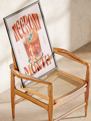
I was asked to assist the design company 'Natural Selection' in their Illustrations for a breif set by Rudy's Pizza, a pizzaria chain located in Manchester.
The Illustrations needed to promote Negroni week and feature the branding for Campari, a component to the cocktail.
I created 5 Illustrations for them to submit and this resulted in two of them, the lady and the big hand, to be selected for the merchandise for the promotion.

PHOTOS BY
@NATURAL_SELECTION_DESIGN
@wearerudyspizza

ZODIAC
LINO
As a personal mini project I have created a series of lino cuts of the 12 zodiac signs; Aires, Taurus, Gemini, Cancer, Leo, Virgo, Libra, Scorpio, Sagittarius, Capricorn, Aquarius and Picese.
The project was a fun dive into creating unique yet cohesive prints that stand out individually. My goals were to explore bold shapes as I used a small square of lino that didn't offer much in allowing details. The characters had to be easily recognisable and their individual elements intertwined conceptually. I did also attempt to include the corresponding constellations however, the limited space didn't always allow this.
Overall, I'm extremely happy with how they all turned out, all are unique and stand out. Although, at some points designs became too ambitious, leaving squashed and unreadable designs, like virgo and Aquarius or trying too much leaving uninspired designs like scorpio.
Perhaps in the future I'll go back and re-make these designs but for now I'm content with the project's outcome.


